1
2
thanks a lot, and yeah, i was thinking the third one (lighter black striping) was best too.
http://i226.photobucket.com/albums/dd66/davyc412/side2.jpg
thickened the lines between grey and white, dont know if its better or not though.
http://i226.photobucket.com/al ... d66/davyc412/sidenew2.jpg
and heres one where i thickened the lines between blue and grey
http://i226.photobucket.com/al ... 6/davyc412/sidelight2.jpg
and one where the trim is a bit lighter in color
Last edited by DavyC412, .
yeah, im definitley planning on that, not sure quite which sponsors i want to use just yet, but i want to get the base paint done before i start working on that.
Wip - fxo
http://i226.photobucket.com/albums/dd66/davyc412/FRONT-1.jpg
http://i226.photobucket.com/albums/dd66/davyc412/back1.jpg
http://i226.photobucket.com/albums/dd66/davyc412/back2-1.jpg
http://i226.photobucket.com/albums/dd66/davyc412/side.jpg
any suggestions? im not really feeling where the side stripes meet at the back, and im wonding if i should add some sort of brightly colored tapered stripe as an accent running from the back to the front, bottom to top?
you pretty much said everything that I was thinking. use major and minor sponsors. the colors you have would indicate that your major sponsor would be either AMD or logitech. use a huge decal of that on the front and sides. minor sponsors you fill in smaller everywhere else (sideskirts, quarterpanels etc)
i even wondered about the bumper color

but other than that, i like the idea that youve put on computer sponsors rather than race sponsors, because, as you said, this is a SIM, so that really makes more sense.
Awesome, thanks for the links. I think im gonna remake what ive done of the vette, because i found that i still have the paths for everything except the badges and a few other elements that i should be able to easily reproduce (thankfully).
usually what i do is drop a guideline at the midpoint of the car, path out half of the pattern and stop at the midline, set up a layer mask, then duplicate adn flip it for the other side, then merge the layers. but i drew the patterns as paths and not vectors so i still had a copy after the merge. woot.
usually what i do is drop a guideline at the midpoint of the car, path out half of the pattern and stop at the midline, set up a layer mask, then duplicate adn flip it for the other side, then merge the layers. but i drew the patterns as paths and not vectors so i still had a copy after the merge. woot.
yeah, i know its low res. i build all my skins at 1024  i should probably start doing them at 2048 but i use 1024 online which is why i build them at 1024. (i also dont have any 2048 templates... im using the ones that came with the CMX viewer as bodykit/shadowing and theyre 1024)
unfortunatley its not just an issue of resizing the image, because i think some of the layers are in vector (which is great, because those will scale fine) but some of it is in rasterized format, which means i would have to remake half of it.
 i should probably start doing them at 2048 but i use 1024 online which is why i build them at 1024. (i also dont have any 2048 templates... im using the ones that came with the CMX viewer as bodykit/shadowing and theyre 1024)
unfortunatley its not just an issue of resizing the image, because i think some of the layers are in vector (which is great, because those will scale fine) but some of it is in rasterized format, which means i would have to remake half of it.
thanks man. anyway, did a little more work on it. finished the stripes to the back. and built up the back end. also added some lighting to the front stripe and attempted to clean up the wheel vents a tad.
http://i226.photobucket.com/albums/dd66/davyc412/front.jpg
http://i226.photobucket.com/albums/dd66/davyc412/back2.jpg
http://i226.photobucket.com/albums/dd66/davyc412/front.jpg
http://i226.photobucket.com/albums/dd66/davyc412/back2.jpg
Last edited by DavyC412, .
i have to agree with chisuu, the color pallate you used is very weird. the best way to figure out what a good color combo to use is to just google a race car of the base color you want (in your case, green) and see what supporting colors others use in real life.
that color of green you used seems to always either be used with black, or other pastels, yellow and blue. but the edges are always rounded, so you may want to reconsider your pallate alltogether.
also the text on teh side isnt that great. make it smaller and bold it, remove the "Driver:" and just put a tiny little flag (your country, obviously) and tuck it right up underneath the side window and itll look a lot nicer.
also learn to paint over multiple peices of the templates. all you seem to have done is put orange and green boxes all ove the skin so the colors suddenly end/change
thats a very complicated question... the most simplified answer is you
(1) download the CMX viewer
(2) open one of the default templtaes in there in an image editing program
(2) paint your skin over the default template.
i have this problem on occasion. i just go to the options menu and turn the wheel lock to lock and that fixes it. also sometimes will happen with the pedals if i dont calibrate (a small tap will be full brake for example). just depress the throttle, brake adn clutch fully and release and that will fix it.
Some FZR and FZ5
Heres an FZ5 skin ive been working on a bit, tried to go for something different, made it a little more elegant/luxurious with a couple of hints of racy rather than pure race. kind of took some hints from the veyron.
the racy bits are that the hood and tunk lid are both made from a very tight weave and very dark carbon fibre, which may be hard to see in this picture. also, the saleen/skyline-ish trim that surrounds the taillights, and the extension of the side trim down the back, which gives it more of a roadster look from the rear. obviously also the ferrari badges, and teh few sponsors at teh bottom. the more classy bits are the color schemes (black adn silver), and teh panneled look of all the colors in the pallate i used.
http://i226.photobucket.com/albums/dd66/davyc412/new-1.jpg
http://i226.photobucket.com/al ... 66/davyc412/untitled2.jpg
and heres an FZR thats based on a vette C6 thats maybe like 40% done
http://i226.photobucket.com/al ... c412/Untitled-1copy-2.jpg
im thinking of leaving these two private (at least for now)
also, if anyone has any ideas that i can use to give the vents over the wheel wells more depth, id really appreciate it. i dropped a shadow upwards to try to give it more depth, which helped, but could still be better.
Last edited by DavyC412, .
thanks.
heres the skin
http://img123.imageshack.us/img123/4750/foxnigel.jpg
1024, and i removed the numbers so you can put your own in if you want. if you want to add your own, i used impact with color ad0000
my (unfaithful) reproduction of nigel mansell's williams formula one circa 1988.
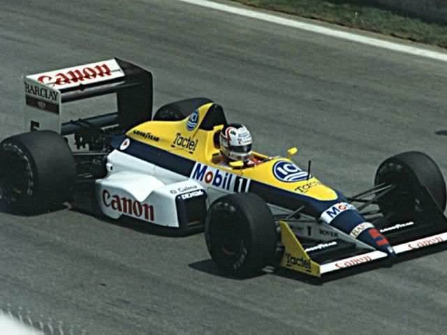
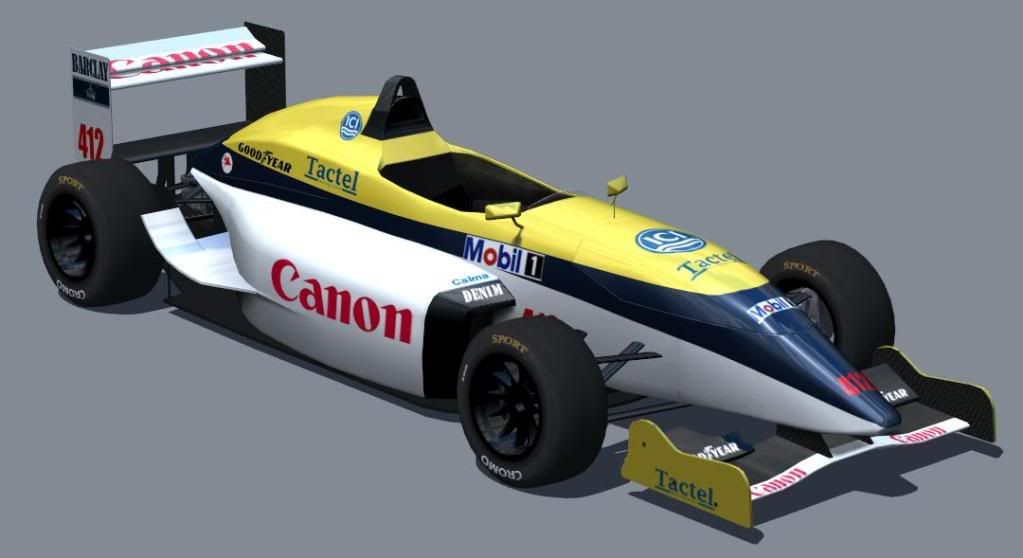


thanks for the font, i wasnt really feeling the numbers tho when i changed the font. i suppose i never intended it to be a faithful replica of hamlin's car anyway.
anyway, added some minor sponsors.
http://i226.photobucket.com/albums/dd66/davyc412/new.jpg
anyway, added some minor sponsors.
http://i226.photobucket.com/albums/dd66/davyc412/new.jpg
thanks for the suggestions. i dont konw what happened with the chevy logo to make it smear like that, but it was too large anyway. i moved it higher so i didnt have to split it over the hood and bumper and made it smaller. also multiplied the tears and rear so it has more dimension and i removed that black skirting that was above the splitter and side, as well as the rivets to make it look a little cleaner.
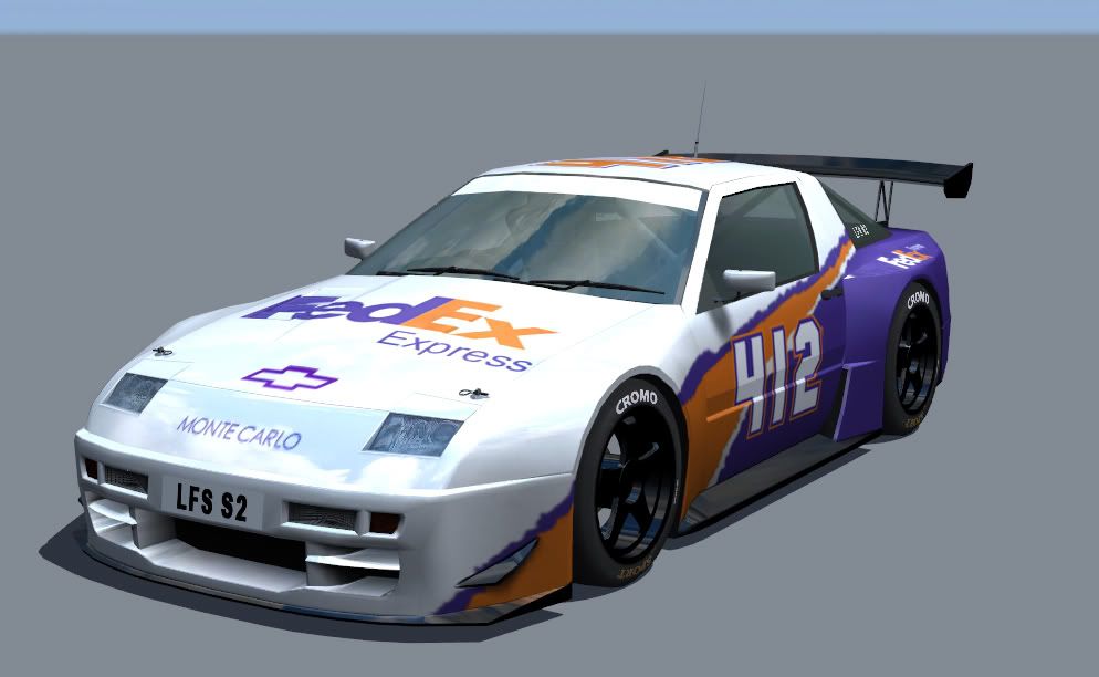
still not happy with the font tho

still not happy with the font tho
Last edited by DavyC412, .
my First skin (XRR) (WIP)
decided to go for a nascar look, and make the number 11 FedEx car but with 412 instead. i couldnt really find the right font for the numbers so i had to go with the closest i could find, which kind of annoys me
anyway, i still need to put on minor sponsors.
also the Fedex on the door doesnt fit well, it covers the handle. i couldnt find a way to fit it over the wheel arch properly, which is why its there.
any other suggestions?
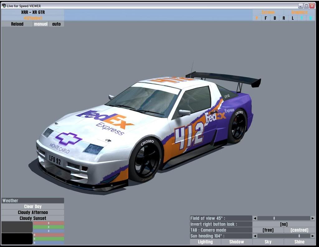
anyway, i still need to put on minor sponsors.
also the Fedex on the door doesnt fit well, it covers the handle. i couldnt find a way to fit it over the wheel arch properly, which is why its there.
any other suggestions?

1
2
FGED GREDG RDFGDR GSFDG