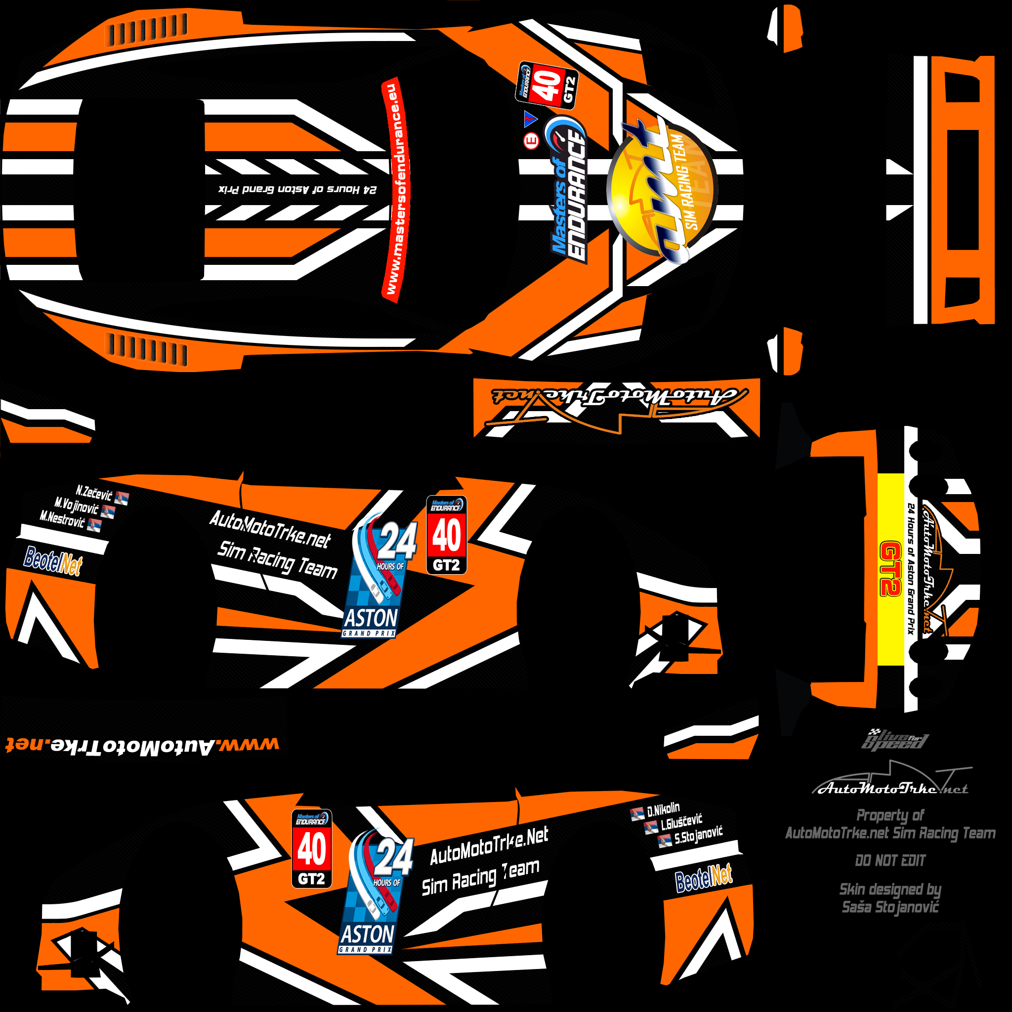
I really like the GT1 skin but the GT2 doesn't fit for me, maybe a red sunset would have worked better?
Josh went ahead and sent them over. Thanks!
Thinking about it, i could probably put that back in now, because it was originally in there, however trying to get all the gradients to line up around the skin is a real nightmare, its bad enough on the Merc skins because of the grey gradient in the middle (the single seaters are terrible!). I managed to get it in using a 2nd gradient on the rear, going from top to bottom, and just letting the light blue fade to nothing. So im betting i could put some orange in there, however sadly you wouldnt get much in there as the points where the sides and top meet round the skin is quite wildly varied, could be blended manually maybe... but it was supposed to be a 2 min "can you put the logo & driver names on a skin for us" job hehe
Really nice skins, Paul. Good work. 

Great skins there Paul!
We don't really want to give away ours yet.. but here's two teasers by Bas:
http://www.1stracing.nl/gt1
http://www.1stracing.nl/gt2

We don't really want to give away ours yet.. but here's two teasers by Bas:
http://www.1stracing.nl/gt1
http://www.1stracing.nl/gt2

AutoMotoTrke.net Sim Racing Team
Soon...
Soon...

Added the render about an hour ago, and also adding a 3rd one, we need a GT3 catagory now :P

http://www.mercuryracingteam.com/pc2k/FZR_M_MoE4-4b2.jpg
The Merc guys havent even see this, the idiots are practicing instead, seems they care more about that then how their skins look


http://www.mercuryracingteam.com/pc2k/FZR_M_MoE4-4b2.jpg
The Merc guys havent even see this, the idiots are practicing instead, seems they care more about that then how their skins look


I like it more  second link doesn't work though.
 second link doesn't work though.
A proper teaser for AutoMotoTrke.net Sim Racing Team 

fixed, put a _ in there when it didnt need it hehe
I *LOVE* orange, and i actually tried to do this exact theme last year, but it was pretty poor. Last year our GT1 & GT2 colours were Blue & Orange, so it would have worked perfectly, i just couldnt pull it off for some reason. I think I just felt it was too hard to get a nice gradient without faults where 'corners' met, maybe the FZR is easier than the XRR

Thanks for the comments from everyone too

& traxxion, no sneekin :P Ima gonna send out my skin ninjas, and they'll infiltrate F1RST HQ!!
Theres no ninja smilie, so have a bunny rabbit instead :bunny3: Ninja Bunnies!!
Nice work Paul. I like the lighter blue more
I'd post a teaser of what I've got in the works.. but I'm too busy working on it.. still.. 

As much as i like the orange as a colour, i dont think the theme is really as visable in this case. Maybe, in all 3 cases, it could have been better to do the theme from nose to tail, rather than side to roof, although it might seem a little lost when looking at it from a typical view (side on, rather than from above).
The blue is clearer what the theme is supposed to be i guess, though they're all probably a little too vivid in their colour.
The blue is clearer what the theme is supposed to be i guess, though they're all probably a little too vivid in their colour.
And a proper teaser 
Cowabunga!

Cowabunga!
[SR] Cowabunga! approves this skin.

Good, so you're driving with grooved tyres. That will make one less opponent. :P
Yes it's all part of... the... amazing... plan...erm...

Well we probably had no chance to beat you anyway.


maybe theyre expecting rain

Didn't you know it's going to rain the whole race? 
Edit: Damn you Simon

Edit: Damn you Simon

#40 GT2 AutoMotoTrke.net Sim Racing Team skin
For this event we have special skin painted with even more special paint that will lower the air resistance, so we expect to be unf***able quick...

Renders:
http://img232.imageshack.us/img232/1958/moe24hhr2zv1.jpg
http://img105.imageshack.us/img105/3537/moe24hhr3jk2.jpg
http://img233.imageshack.us/img233/3339/moe24hhr7vf3.jpg
http://img67.imageshack.us/img67/6918/moe24hhr6yt2.jpg
http://img232.imageshack.us/img232/8296/moe24hhr1oe9.jpg
For this event we have special skin painted with even more special paint that will lower the air resistance, so we expect to be unf***able quick...

Renders:
http://img232.imageshack.us/img232/1958/moe24hhr2zv1.jpg
http://img105.imageshack.us/img105/3537/moe24hhr3jk2.jpg
http://img233.imageshack.us/img233/3339/moe24hhr7vf3.jpg
http://img67.imageshack.us/img67/6918/moe24hhr6yt2.jpg
http://img232.imageshack.us/img232/8296/moe24hhr1oe9.jpg
Remember, tonight is the deadline for both contests' entries.
Thanks!
Thanks!
Thanks, everyone, for all your entries. Polls should be up later today for the team skins competition. 

The admin team have chosen the winner of the Safety Car competition for the 24 hour race. Without further ado, the winner is...drumroll please...
Robby Mac for his excellent FZ5 skin. We loved the integration of the Masters of Endurance Logo into the skin and the clean execution of the design. His skin will be on the safety car this round and he'll also get a mention during the broadcast. Thanks for all the entires everyone, shame there could only be one winner!
Robby Mac for his excellent FZ5 skin. We loved the integration of the Masters of Endurance Logo into the skin and the clean execution of the design. His skin will be on the safety car this round and he'll also get a mention during the broadcast. Thanks for all the entires everyone, shame there could only be one winner!
Grats!
Masters of Endurance: 24 Hours of Aston GP Skinning Contests!
(103 posts, started )
FGED GREDG RDFGDR GSFDG
