Stiffy?
Stiffy?

Bertie!
Wait, crap, no one's gonna get that


Lol? Stiffy?
What about OLOLOLOLOLOL?


I have to give my congratulations to you Lynce, and everyone that helped, because you did a great job. It's really good 

stop posting random pictures..... we don't want this thread locked..
(Lynce)
DELETED
by Lynce

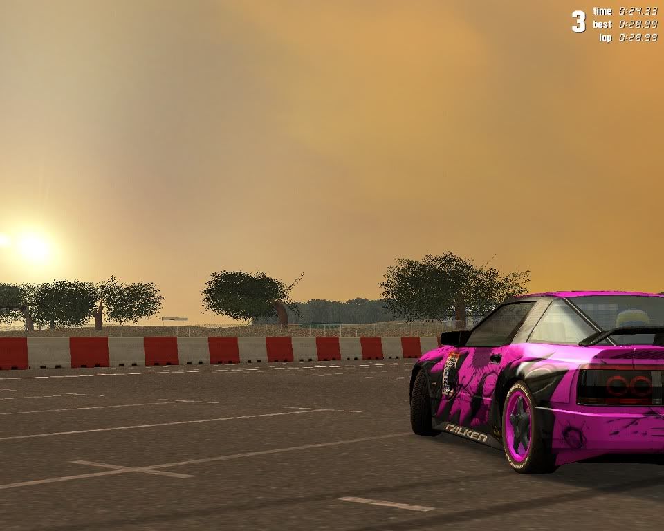
On the Screen (unedited screen, except the shadow behind "Revolution Pack 28th..." on the Bodywork):
FZ50 Kyoto GP Track Rev. Sunset. FZ_interior1.dds. Edited dds file.
The Revolution Pack and the last version (April 7th 2009), respect the agreement.
Thanks for the coments.
Good 

Very nice 
Although I dig your lights, maybe you should arrange them a bit more 'vertically', if you know what I mean. LFS' arrangement of the FZ front lights just don't fit the car IMO.

Although I dig your lights, maybe you should arrange them a bit more 'vertically', if you know what I mean. LFS' arrangement of the FZ front lights just don't fit the car IMO.
I'm an avid user of your Revolution Pack... I can't wait for the August Release!
(Lynce)
DELETED
by Lynce
All news over next Revolution Pack, next movies, next improvements and next sites as HPS in this link.
Revolution Pack's Blog:
http://revolutionpack.wordpress.com/
Thanks to everybody for comments, help/suports and encouragements.
Revolution Pack's Blog:
http://revolutionpack.wordpress.com/
Thanks to everybody for comments, help/suports and encouragements.

Date unconfirmed.
It will keep updated everyday. Read the blog everyday and subscribing to it .
http://revolutionpack.wordpress.com/
Preview pic. Unedited (only postproduction for the After/before and "original" and "Revolution Pack August 28th). Is not a mod (dds edition):

Don't forget that he blog will be updated with new videos, pictures, developement parts from webs dedicated to LFS, such as HPS, developement parts of videos, how-tos (very possibly). And contents joined with motorsports as offtopic (real motorsports).
Last post in this thread about news.
Note:
The Revolution Pack and the last version (April 7th 2009), respect the agreement.
Can´t wait for your pack. Looks great as always. God, I´m so glad that I don´t have to go to school in August.
 God, I´m so glad that I don´t have to go to school in August.
Damn those FZ lights and grille look nice! Can't wait!
You never fail to please my eyes Lynce.
You never fail to please my eyes Lynce.
Lookin good Lynce. My only comment is that the headlights on the FZ look too small to me. Nicely detailed, but I Think they could be a little larger. 

Yes agreed. They should be a bit larger

something looks a bit dodgy with the menus after installing this pack. Wonder if someone could confirm if there is a problem?
I have highlited the parts that do not look right. The rectange graphics appear to be out of place

I have highlited the parts that do not look right. The rectange graphics appear to be out of place
Don't see a pic?
Thats because of the different resolution it is made for.
Ah ok, thought that might be the case. Guess ill just revert back to the original ones

Lynce, your work is awesome! Devs should really learn from you something. Think about cooperating with LFS developers. You could bring LFS into new level.
I'm sure Devs are well aware of Lynce's (as well af for other talented artists) detailed work and capabilities...
That's realy nice, i cant wait for it. Great job Lynce  !
!
 !
!Thanks for the awesome pack 


The Revolution Pack. April 7th, 2009.
(542 posts, started )
FGED GREDG RDFGDR GSFDG