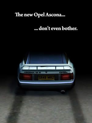
voted for @TypeRacing
Colins12.. few problems.. 1 NEVER save as a png and upload on a slow server, it took me 5 minutes to download that image, i came close to not even wanting to see it at that rate. (seeing firefox would give up every minute and I didn't even come close to seeing a quarter of the image)
Also there is a lot of wasted space, this is supposed to be a car advert, you just have an image with text.
Congrats to those of you who have accomplished the idea of this competition
@FlameCZE
@Bean0 (could've been cleaner but you had something going there)
@minimaxman
@TypeRacing
@RS1T
@newtonyo (btw LOVE those headlights on the FZ!)
for a lot of you, you had either lots of open space, or the space you filled it felt very cramped after that and I couldn't look at it for to long
for example @Furious-Fast the biggest problem with yours is I don't know what to look at, it isn't very clear what you are trying to sell with that image, you say three cars are good at three things, but then RB4 doesn't get much more space it just says everything..
IMO your concept and idea of selling are great, but I think if you thought through the image more it would've been much better
I think if I had that image I would have PROVEN the RB4 is a better at these things, aka shots of the RB4 in front of the other car, some you could do that side shot like you did the XR in rallyx, another from the taillights of one car looking down the track to see the RB4
sorry for going on, this is what my art major has done to me.. turned me into a critic

.. oh well I need the practice before classes start hah!


