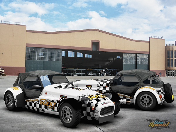
Lol , I'm doing all my renders with blender , seems u have never used blender urself , or at least u didn't know how to use it ...
Lol , I'm doing all my renders with blender , seems u have never used blender urself , or at least u didn't know how to use it ...
I didn't know how to use :P
Gustix used/uses blender and look at his renders. One of the best renders that can be found here.

k , lol
I agree with Gustix s,
would like to add this.
You must have somewhere to start.
it's like riding a bike, the first time it was not as good.
so
Creativity is: Invent experiments, growing, taking Risks, breaking rules, making mistakes, and having fun.
would like to add this.
You must have somewhere to start.

it's like riding a bike, the first time it was not as good.
so
Creativity is: Invent experiments, growing, taking Risks, breaking rules, making mistakes, and having fun.

finally got the lighting sussed still errors tho, ..
 still errors tho, ..
Lol , sry but it looks awful ...
that's what I think , no offence...


:munching_
I know, im jus learnin  post sum helpful tips
  ,
,
 post sum helpful tips
  ,
,Doing tests with 3ds max.
C&C are welcome
C&C are welcome
To begin with, firstly try to fit your model into the frame, try to leave some space from border, it will look better. Furthermore, for learning, studio renders are better, as they are easier to do, don't try to do any fancy stuff, just do simple studio renders, plain background and few lights. I'll attach some of my first tries
awsome renders !
i have started over, i jus read ya post fast, cheers for tips  i made this, its not finished, gotta work on wheels and all that blue, plus my glass deforms everything, im not sure if thats jus the reflection or sumthing wrong, im jus using brazil glass, is simple and a ok view, needs zooming in on tho,, dam i cant believe i posted that last render ..
Uploaded a near completed update of my render
 i made this, its not finished, gotta work on wheels and all that blue, plus my glass deforms everything, im not sure if thats jus the reflection or sumthing wrong, im jus using brazil glass, is simple and a ok view, needs zooming in on tho,, dam i cant believe i posted that last render ..
Uploaded a near completed update of my render

wow


 check my render i posted, i think its a step up from the last 1
PS: im into the photorealistic stuff

So, I made this simple render with my new FZR skin in Blender, and I got pretty satisfied. I have some questions though, The windows aren't reflected in the floor, AND after i changed the textures on the car, the front light looks a bit weird, with the light texture being black, but the rest under the glass is brighter. Got some ideas what it can be?
simplicity.
Made small render for my team skins after long time 

Could it be the windows are set to not be reflected? I'm not a Blender user so that's the sort of guesses I can make

Front light: That's the reflection you are seeing. You need to tweak whatever you are using to be reflected, to be reflected on areas you want, but not where you don't want them. Welcome to the fabulous world of studio shots

I think you are trying hard (that's meant as a compliment) but need to pay more attention to lighting. I'm sure the quality of your renders will skyrocket ones you do.
Very nice. Smooth and stylish
 Few comments though: Remember to frame properly (XRG rear is clipped by the edge of the render). The logo looks misplaced and off style. If that's how the logo looks then there isn't anything to do about that, but placing it for example somewhere above the cars would work better IMO.
my first lfs render 


Everything is great, but those soft roofs look kinda weird.
Material editor, pick an empty slot, click pipette tool and then click on the object to get its materials.
Okay, thanks. That's what they told me once, but I had forgotten it. I'll do it next time if I don't forget.
3D LFS renders
(8243 posts, started )
FGED GREDG RDFGDR GSFDG
