NASA's APOD and Image Of The Day.
Have some orange..


Massive upgrade from Nokia 6020
What phone is that?

function > form
Jolla with Sailfish OS... the UI takes some getting used to but I'm really starting to like it.
Very interesting stuff.. never heard of it before.
It's basically a continuation of Nokia's Maemo and MeeGo. The OS looks quite promising although it's obviously in a beta stage.

<3
That's a lockscreen
#anarchy #f***thepolice #sohardcore
I'll maybe post my desktop later when I'll make it pretty, if I ever will
I'll maybe post my desktop later when I'll make it pretty, if I ever will
Very basic AOSP stuff, CM11 snapshot ROM.


So it seems the stock GEL launcher in Cyanogenmod supports icon packs of other launchers now. 


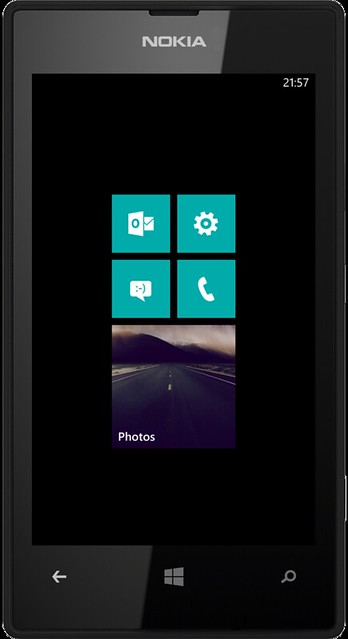
Not a bad idea, since you can just slide over to the apps on the right. I'm just not a fan of that teal colour. I still like the cyan a lot. I wish there was a black/white colour to match my cases.
Other tiles are below, i just separated them with a big empty tile for the 'homescreen'.

Keeping it simple. :3
Is it just me or Android still has not grasped concept of usability?
White text on light grey background is just pure genius.
That being said, compared to Android, iOS looks awesome.
White text on light grey background is just pure genius.
That being said, compared to Android, iOS looks awesome.

It is just you.
You really need to explain that part...
And I've never experienced that this white text is somehow unreadable, it also looks better, so I don't have problem with that...
Nope, you're right on the money.
Whenever I see a WP phone I think I'm in a damn bathroom.
Design pls.
Design pls.
lol

Your bathroom has blue tiles that randomly display photo's and text and flip?

Post your Mobile Desktop..
(555 posts, started )
FGED GREDG RDFGDR GSFDG
