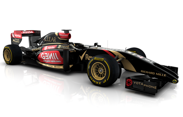
Do they erect at high speed to reduce drag from the front wing?
Do they erect at high speed to reduce drag from the front wing?
^^ aahahhahaha
Seriously, who there thought that would be a good idea. Wtf, I never thought we'd see something this ugly in F1; I actually thought it was a joke when I saw the Force India sketch.
Seriously, who there thought that would be a good idea. Wtf, I never thought we'd see something this ugly in F1; I actually thought it was a joke when I saw the Force India sketch.
They wanted low noses to try to avoid cars riding up quite so much during contact. So they said the tip of the nose had to be a certain max height, with a certain maximum cross section.
But that's not good for the aero, and the loophole is to have a penis nose for a while to satisfy the regs with minimum aero impact, and then a conventional high nose to get as much air under the tub and around the sidepods to the rear.
It's no so much that they told teams to do this explicitly, but more that they didn't see the impact of what WASN'T regulated.
Dick nose strikes again!


The complex front wing elements look almost as bad as the penis.
Don't be real Don't be real Don't be real Don't be real


The worse thing about the McLaren is dick nose aside, it'd be a handsome car... if the regs were written properly!!
Scarbs has already questioned the legality of the Lotus nose - https://twitter.com/ScarbsF1/status/426689878072389633
This is amazing. Just burst out with laughter in the office and couldn't stop for ages. What the actual hell is this.
And here it is, the new McLaren F1 car


The noses did not come unexpected, but the reality is even worse than any sketch.
I think the McLaren isn't that bad an interpretation of the rules though. It's not nice, but I was expecting worse.
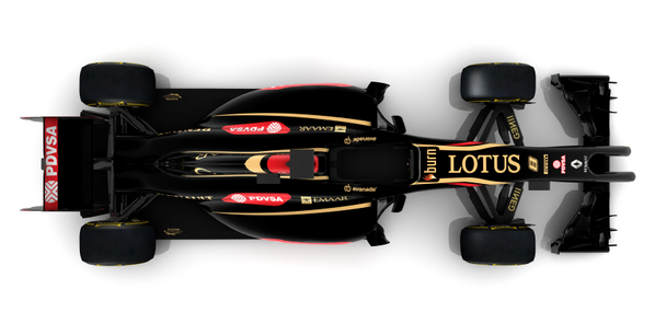
The Lotus pic looks fake. Looks like a low quality 3DSMax render, and the nose(s) aren't the same length, or the perspective is wrong. I think it's a prank two-fingers at McLaren for 'stealing' their Frenchman.
The Lotus pic looks fake. Looks like a low quality 3DSMax render, and the nose(s) aren't the same length, or the perspective is wrong. I think it's a prank two-fingers at McLaren for 'stealing' their Frenchman.
I'm guessing the McLaren isnt a finished livery? it seems to be missing a lot of sponsers.
They've said they won't have a new title sponsor for the first test.
I don't mind the McLaren nose from the front, but it looks real bad from the side, for sure.
Did you look at the picture?
I know Lotus posted it. I still don't think it's real. Anybody who can draw cars would get the perspective right, and a 3D renderer would too. So I'm calling foul.
If the forks were even they'd be illegal so being uneven makes sense if this design is accurate. Also Lotus would be pissing off plenty of journalists and media by posting fake images. if that's a game they want to play it won't end well.
and here's another pic confirmed that the uneven nose is indeed correct.

and here's another pic confirmed that the uneven nose is indeed correct.

(TypeRacing)
DELETED
by TypeRacing : ninja'd

I read Scarbs' tweet too (although you didn't mention that bit). It would seem it's a 'creative' solution to the problem. Which is to be applauded within the strict rules. But it is pretty horrible!
I prefer the look of the double nose (aka Vagina nose) to the Dildo nose of the other cars.
(Intrepid)
DELETED
by Intrepid
This thread is closed
Formula 1 Season 2014
(1760 posts, closed, started )
FGED GREDG RDFGDR GSFDG