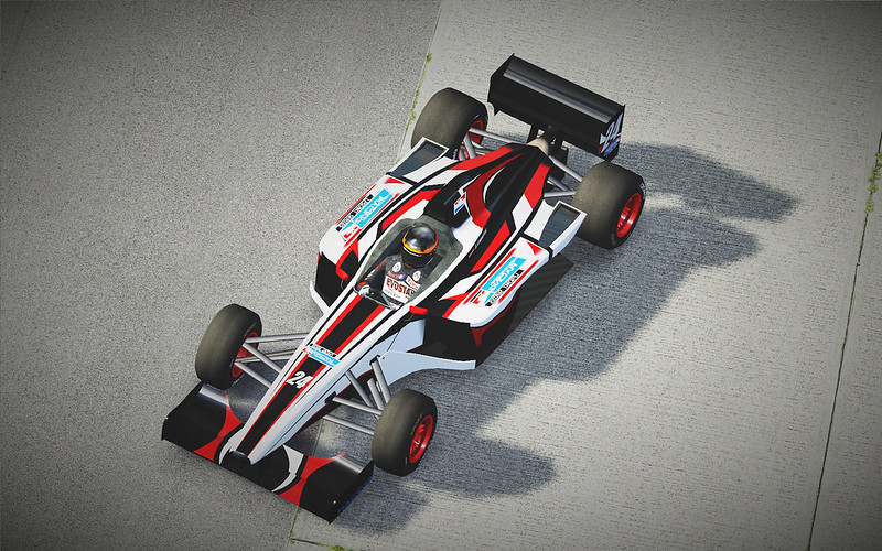
Oh how so little things change in so much time.
nice


Who have Mclaren Honda Marlboro - 90th A.Senna for FO8 ?? post here please 

FO8 RFX-2 


Very nice skin! 

Indycar
Hi guys, does anyone have any Indycar skins? Preferably for the F08 

Another Formula Renault....
This time the prototype livery for the Formula Renault 2.0, it's not perfect as the newer car is very different shapewise to the formula XR, but I hope I got reasonably close.


DOWNLOAD (4096x)
(Uploaded to LFSW, FOX_Formulareno)
This time the prototype livery for the Formula Renault 2.0, it's not perfect as the newer car is very different shapewise to the formula XR, but I hope I got reasonably close.


DOWNLOAD (4096x)
(Uploaded to LFSW, FOX_Formulareno)
can i haz mouse?
i cant download your skin pack for someone reason
Maybe it has something to do with the fact that the pack was posted over 10 years ago

Brilliant !
I notice that i tend to use beer sponsors on my liveries often :]]
This one is private, couldn't decide on color, so i made 3 versions
This one is private, couldn't decide on color, so i made 3 versions

What you guys think?
I used photoshop, what do you guys use?
oh, i lost my loooong reply i had typed 
so in short, cool skin, but you have all sorts of little errors there:
- stripes not lining up (for example transition between the roll hoop and the back of the cockpit, also the one on the nose is slightly off center)
- all of the stripes cut off abruptly on the edge of nose/sidepod, these use another bit of the texture
- your logos are stretched, LFS doesn't use the skin 'as-is' but stretches it over the car model, you can find a guide for that here: https://www.lfs.net/forum/thread/64975-The-Stretching-of-Skins
- the Nismo logo is right where the suspension mounts are.
- the geometric shapes on the side of the noseare in different heights on each side
a couple of tips:
- shrink your logos as neccessary, see the above guide for help
- if you don't already, use LFS viewer (see the downloads section on homepage) to preview your skin while working on it
- reference the wireframe for alignment
- use shadow layers on your skins to make the less flat and more real, Master skinnerz kits usually come with one, or you can try this https://www.lfs.net/forum/thread/23675
Happy skinning!
Thanks a lot. I've been looking for this type of information. But one question about the shadow layers. I downloaded them before, but I dont know how to use them or make them appear on the car. Any instructions?
for shadow layers, place them on top layer of your skin (i usually have the black mask and wireframe above, but that doesn't really matter)
then change the layer blending mode to 'multiply' and adjust the opacity to taste

then change the layer blending mode to 'multiply' and adjust the opacity to taste

Thanks 

Just curious, but wanna work on a couple of skins with me? Or even show me some more tips and tricks?
Hi, don't have much time or will to make skins at the moment, but feel free to PM if you need some help, alternatively you can try the WIP subforum 

Life4Pixel skins
All FOX and FO8 skins I got from the L4P website before it went down.

Made a replica of this Acura LMP concept,I pretty like the livery,hope you enjoy it

A few FOX skins I made a long time ago. No previews, though
Skins F08 and FOX Gonzalo "Gonchi" Rodríguez Team Astromega and ADRacing
Hi, I do not know where to share my skins for F08 and FOX, and I thought this would be a perfect place.
I did them a year ago or so, in memory of a compatriot pilot who died on September 11, 1999, he was Gonzalo "El Gonchi" Rodríguez. These skins are a replica of the Astromega team's Formula 1 Jr (1999) and Alan Docking Racing, the British Formula 3 Championship (1995). F08 (Formula V8) and FOX (Formula XR) respectively
Hola, no se dónde compartir mis skins para el F08 y el FOX, y me pareció que este será un lugar perfecto.
Los hice yo hace una año mas o menos, en memoria de un piloto compatriota quién falleció el 11 de septiembre del 1999, el era Gonzalo "El Gonchi" Rodríguez. Estos skins son una réplica de el monoplaza del equipo Astromega, de Fórmula 1 Jr (1999), y del Alan Docking Racing, del Campeonato Británico de Fórmula 3 (1995). F08 (Fórmula V8) y FOX (Fórmula XR)respectivamente
Team Astromega
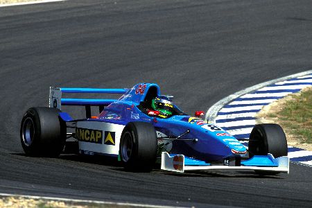
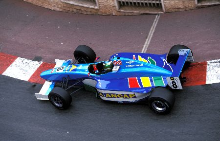
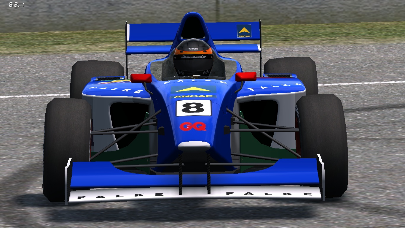
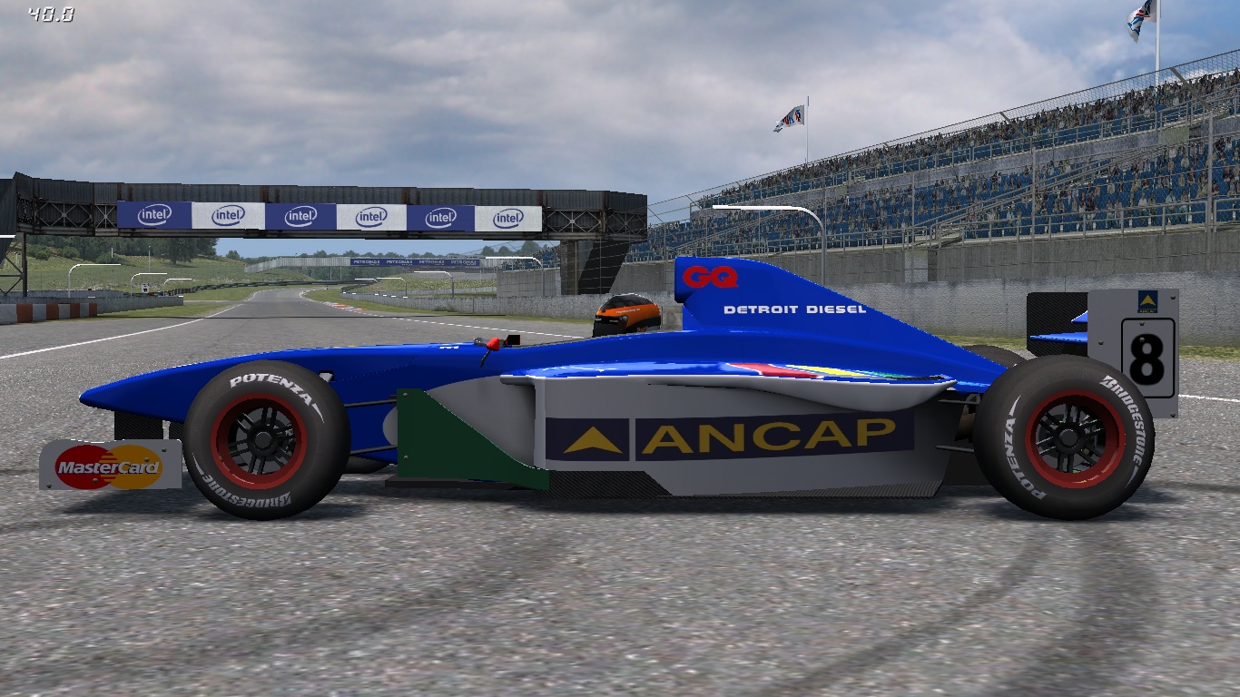
Alan Docking Racing
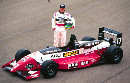
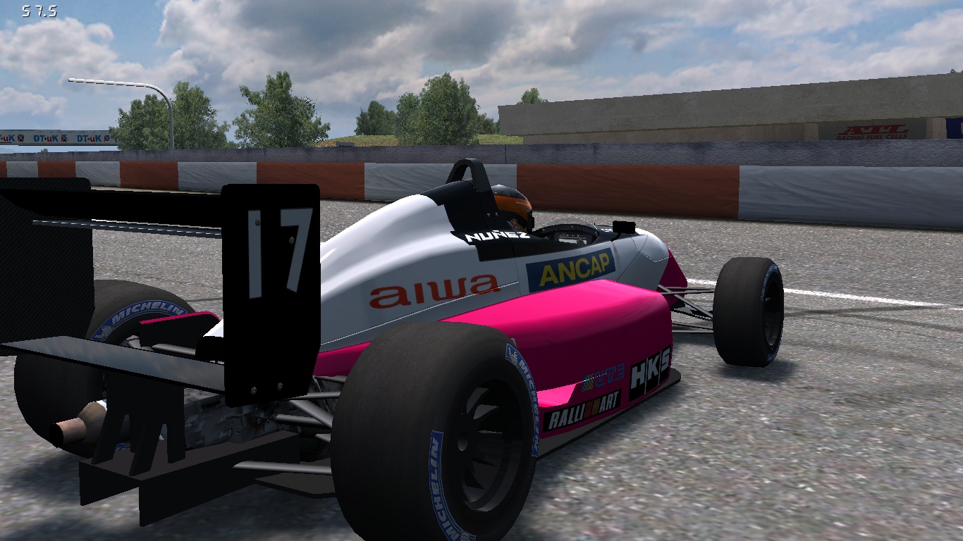
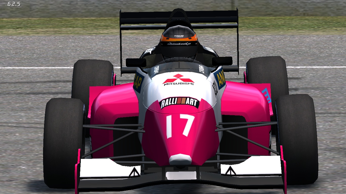
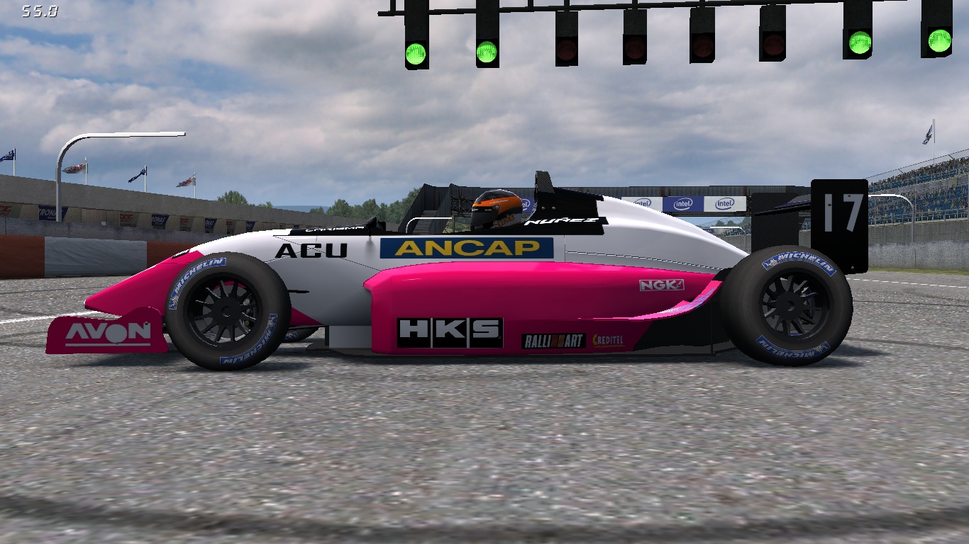
I did them a year ago or so, in memory of a compatriot pilot who died on September 11, 1999, he was Gonzalo "El Gonchi" Rodríguez. These skins are a replica of the Astromega team's Formula 1 Jr (1999) and Alan Docking Racing, the British Formula 3 Championship (1995). F08 (Formula V8) and FOX (Formula XR) respectively
Hola, no se dónde compartir mis skins para el F08 y el FOX, y me pareció que este será un lugar perfecto.
Los hice yo hace una año mas o menos, en memoria de un piloto compatriota quién falleció el 11 de septiembre del 1999, el era Gonzalo "El Gonchi" Rodríguez. Estos skins son una réplica de el monoplaza del equipo Astromega, de Fórmula 1 Jr (1999), y del Alan Docking Racing, del Campeonato Británico de Fórmula 3 (1995). F08 (Fórmula V8) y FOX (Fórmula XR)respectivamente
Team Astromega
Alan Docking Racing
Hi, good effort,
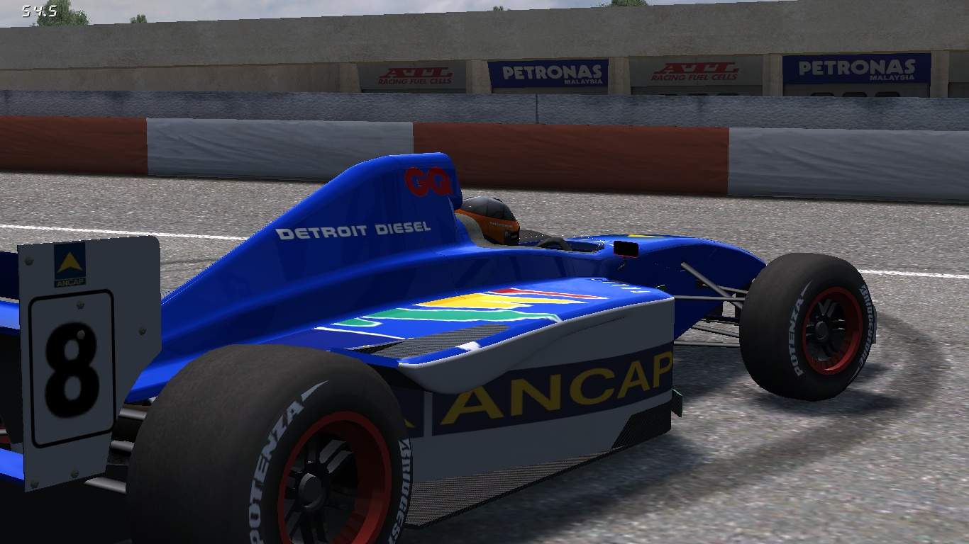
but i noticed that both are missing quite a bit of the sponsorship logos (FO8 - bottom of the sidepods, engine cover, nose - FOX - nose area, headrest, etc...)
Just 2 tips:
1. not sure what software you're using, but if it supports layers and can open PSD, get the master skinnerz templates - much easier to skin a car
2. use this when fitting decals on the car, LFS stretches the skin to wrap around the car model, if you just paste the decals without adjustment they end up stretched ingame - you can see it on the FOX's ANCAP logo
https://www.lfs.net/forum/thread/64975-The-Stretching-of-Skins
FORMULA Skins (XR & V8)
(1450 posts, started )
FGED GREDG RDFGDR GSFDG
