Recently I got a PM with a question about taillight shading of my Felicia mod, which inspired me to start a thread, where modders can share their techniques to learn from each other to make more high quality mods in the future. Therefore I will start with a few visual "tricks" which I have used and might be helpful 
A texture-based ambient occlusion
Sometimes dark points are not enough for a smooth ambient occlusion. In those cases a texture can be used. Professionals can bake it, beginners can draw it by hand (I personally prefer drawing). This texture can be combined using transparent layers.

A shaded roll-cage
A strange looking roll-cage shading is a common problem of many mods. To enthance shading approximations of a cage a simple texture can be used. For a better result, the alpha channel should correlate with black color which will remove unwanted gloss under the ceiling.

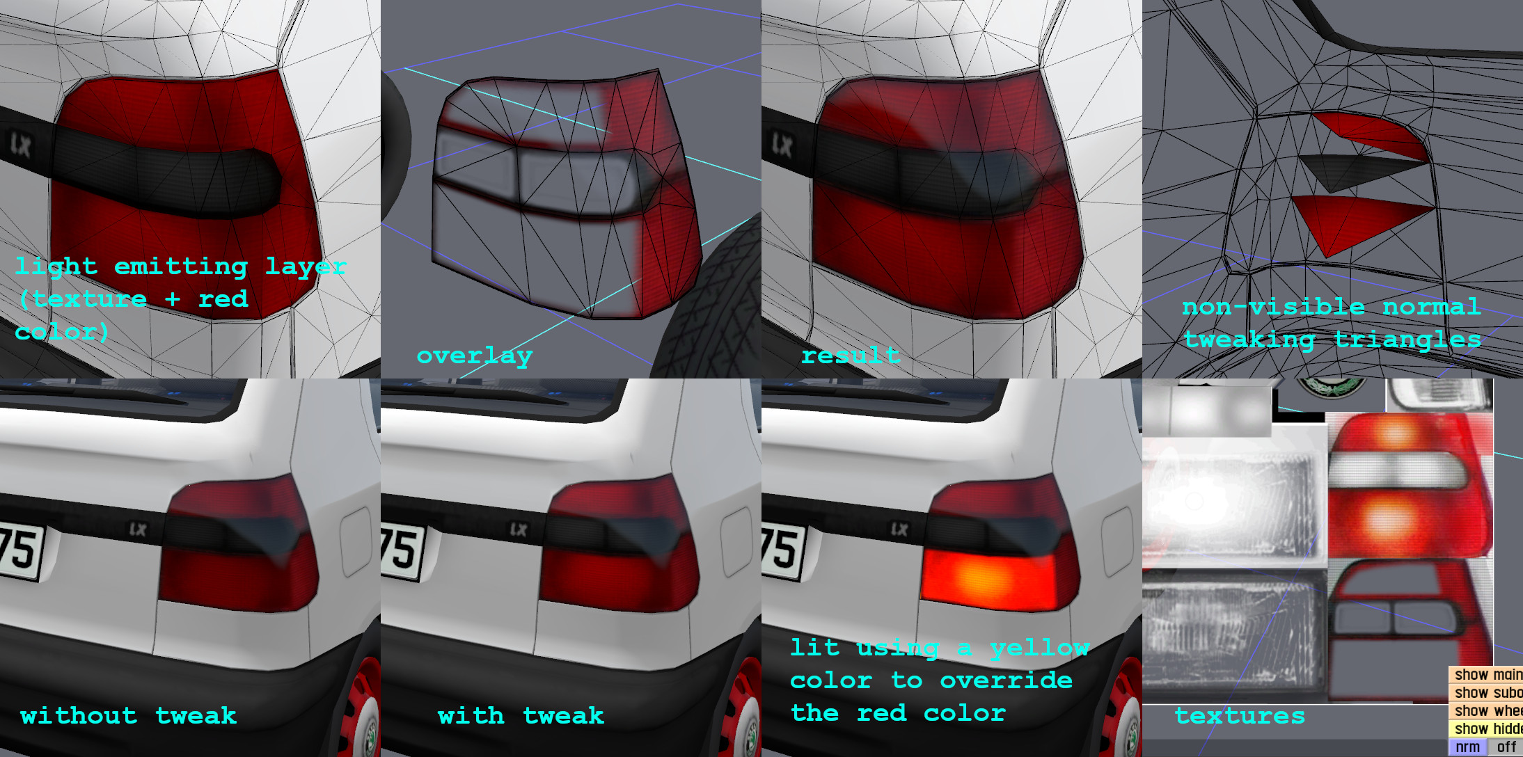
A Felicia tailight effects
I have used multiple "tricks" to build this one. First the "yellow light around a bulb" is done using a texture. The default color of the taillight is red which hides a white places in the texture. The color of a lit taillight is yellow, which overrides the red color.
Secondly, IRL the tailights reflects daylight from various angles. To approximate a distribution of light in a tailight I have tweaked normals using some additional triangles, which are not visible. If you turn the Škoda Felicia mod (using a 3rd person view) in the LFS, you can see, that tailights are shaded quite differently (despite not being fully 3D).

Edit: feel free to post your own tips and tricks in this thread Anything about shading, topology, suspension approximations, realistic aerodynamics, engine sounds etc. could be helpful

A texture-based ambient occlusion
Sometimes dark points are not enough for a smooth ambient occlusion. In those cases a texture can be used. Professionals can bake it, beginners can draw it by hand (I personally prefer drawing). This texture can be combined using transparent layers.
A shaded roll-cage
A strange looking roll-cage shading is a common problem of many mods. To enthance shading approximations of a cage a simple texture can be used. For a better result, the alpha channel should correlate with black color which will remove unwanted gloss under the ceiling.
A Felicia tailight effects
I have used multiple "tricks" to build this one. First the "yellow light around a bulb" is done using a texture. The default color of the taillight is red which hides a white places in the texture. The color of a lit taillight is yellow, which overrides the red color.
Secondly, IRL the tailights reflects daylight from various angles. To approximate a distribution of light in a tailight I have tweaked normals using some additional triangles, which are not visible. If you turn the Škoda Felicia mod (using a 3rd person view) in the LFS, you can see, that tailights are shaded quite differently (despite not being fully 3D).
Edit: feel free to post your own tips and tricks in this thread
 Anything about shading, topology, suspension approximations, realistic aerodynamics, engine sounds etc. could be helpful

 It would be cool to create a window glare / translucent glass effect.