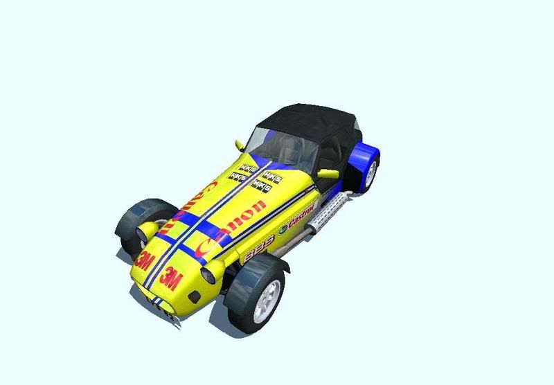
Not too sure about the yellow but thats excellent


 .
. btw I know the default layer is jagged from resizing but I never notice that on the skin anyway. Everything else is high res.


 . Maybe I update it later, maybe even today as that T-rex on the front side doesn't fit with the ninja theme, some kind of ninja art might work better


 ) but imho the engine view stays. I know it doesn't look realistic or like a straight six but the whole skin kinda got started from it.


 resent: