The online racing simulator
Suggestions for graphics menu changes
This is something that has bothered me for a long time and which I think could be improved a lot. I mentioned this at RSC before the forum move but finally put together a proof of concept instead of just talking about it. Here's a (crappy) photochop of what I propose:
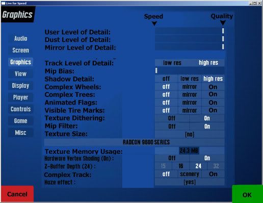


Here's a quick rundown of the changes from how it is now:

1) Things should always be arranged with speed to the left and quality to the right and there are markers to show it. This makes it quicker and easier to see what's enabled and disabled at a glance. I've also changed Yes/No options to On/Off for consistency, and moved the buttons so that Off is to the left (speed) and On is to the right (quality). I meant to change Texture Size to Low Res/High Res to make it consistent with Track Detail but forgot to do it before I uploaded the pic. If these could all be changed to sliders it would look even more uniform and easy to read.

2) The names of most items have been changed so that "On" means "Enabled". As it is now if you want trees enabled you turn off "disable trees" which is a double-negative and totally non-sensical. It's much more clear to turn on complex trees than to turn off disabling of trees.

3) I've moved the texture memory so that it's not the only element floating out there to the right as it is now. Not only does it look out of place, it's a huge waste of space. This allowed the whole interface to be much larger and fill the available space better.

4) I've moved the OK button to the right side and replaced the left side with a Cancel button. Right now if you accidentally change something there's no way to cancel the change and revert to the previous settings.

I think these would be changes that would be pretty simple to implement and would make a big difference in the ease of use of the menu. I'd also suggest moving the "Multiplayer car draw", "Screen clear type", and "Dynamic LOD reduction" items from the Misc tab to the Graphics tab since these are obviously graphics related items. Floating tool tips would also be VERY nice to have, but would probably take a lot of time to implement compared to what I've done here which is mostly text and button changes.
Honestly I think that most of the menu options should have 'rollover' tips that appear, or a small question mark right beside the name of the option. This way you could read about the option in much more detail, rather than asking on the forums . The same applies to the setups/garage, and this has been suggested before... would be very helpful for people that don't know what to do when setting up their own car, or don't know about or what a particular option does.

Having simple options that can be understandable is always good, but to have longer parts to read, that could be a hassle (plus it is more translation work).

Still I know what you mean about this menu. It really is NOT a menu made for a beginner. Once people start to learn this game, then they understand what most of the options do, but others just are so confused with the options because they don't look like any other game... they are in a context very unknown to most people. And like you've noted, the way the menus are currently designed are not the kind of simple easy-to-understand menus. Sliders would be nice in most areas, specific 'high/medium/low' settings, and so on should be put in to make some options have more.... options.

And yeah, the categorizing of the menu is fine, but what is inside each section could really all be moved around to other categories (some). Very dissorganized, but even more of a problem... there is not enough room for most options, so maybe that is why it is the way it is now at the moment.

I'm rambling, but the menus could have improvements indeed :up:
I agree totally with this. When I downloaded and first fired up LFS S1 demo back in February on my old machine, I had a heck of a time trying to figure out what setting did what. I would try to set it up and wouldn't even be able to play due to crap framerates. I ended up figuring out with the help of someone on the server that I had everything maxed to quality rather than speed because I was doing what I thought from all other games I've played. Everything does seem to be backwards and a double negative, ie, turn this off to turn the stuff on and vice versa. Having the options turn on/off for having stuff displayed or not is the best and most easily understandable way to do it. If I don't want trees, I want to turn it off, not say yes to no trees.
#4 - axus
Good idea, I agree with what you have said. I did have trouble with the double negative, I remember that...
Quote from axus :Good idea, I agree with what you have said. I did have trouble with the double negative, I remember that...

Yeah, but now you're a member of that elite group that does understand the menus eh?

/stands by for 'but we have to think of newbies' type posts
#6 - axus
Quote from Doorman :Yeah, but now you're a member of that elite group that does understand the menus eh?

/stands by for 'but we have to think of newbies' type posts

/disapoints Doorman with a question that puts his post back in his face
You were never a beginner?

I really must stop using humour on these forums. :banghead:

Many would say I still am a beginner.
#8 - ORION
When you write "complex trees" this is wrong.
Because setting it to "trees" will make the useer think that complex trees are used in the mirror, but not the rest, even though it will do the opposite.
Thus you must write sth like "complex trees - no, not in mirror, yes", or like Scawen (Disable trees).
I agree with everything. Most people think that Disable wheels, or disable trees on "ON" means that it's better. Confusing really.
Also i think the menu design is really simple, and really looks like it's some arcade game, not a simulation. Everything is so childish, and cartoony. I know that it is not really important, but i think it is the time for re design because LFS has become a very serious product now.
I have one more suggestion:
If you want to change the helmet skin, you need to know where to find it. There is a single button in the player menu, but no explanation what it does. A month ago I wanted to change my helmet skin, but I couldn't find where to do it And recently I accidentally pressed that button, thinking it's some how related to the driver suit or something! Just a text "helmet texture" above the button will do, thank you
Quote from Hyperactive :I have one more suggestion:
If you want to change the helmet skin, you need to know where to find it. There is a single button in the player menu, but no explanation what it does. A month ago I wanted to change my helmet skin, but I couldn't find where to do it And recently I accidentally pressed that button, thinking it's some how related to the driver suit or something! Just a text "helmet texture" above the button will do, thank you

I agree, some parts need some naming done to them. Even the place to change the car's skin is hidden/tucked away. The skin name should be on the left with all the color codes and stuff.
Quote from Tweaker :I agree, some parts need some naming done to them. Even the place to change the car's skin is hidden/tucked away. The skin name should be on the left with all the color codes and stuff.

Hmm, isn't that (the texts on the left) for the sets including the both skin and the color scheme? Though I must admit that the skin selection part could be better placed
Quote from ORION :When you write "complex trees" this is wrong.
Because setting it to "trees" will make the useer think that complex trees are used in the mirror, but not the rest, even though it will do the opposite.
Thus you must write sth like "complex trees - no, not in mirror, yes", or like Scawen (Disable trees).

How about "Complex Trees: Off Low High" or maybe "Off Main View On" or "Off Exclude Mirror On".

You could make the options say just about anything you want if we had popup tool tips that explained that "mirror" means trees will be disabled in the mirror but enabled in the main view. Heck, even if you didn't have tool tips at least this way it's more clear that picking the item on the left (off) gives the best performance and picking the item on the right (on or high) gives the best graphical quality. Even if a user didn't realize that the middle option turned trees off in the mirror, at least they wouldn't be picking "off" thinking that it should be faster when it's actually the slowest.
Yes this is so true... Im sure there are many users out there playing with quite the lowest settings, maybe on an high-end system....


btw. you are using my blue menu background, arent you?

Nice to see that Im not the only one lol
Quote from ORION :Yes this is so true... Im sure there are many users out there playing with quite the lowest settings, maybe on an high-end system....


btw. you are using my blue menu background, arent you?

Nice to see that Im not the only one lol

Yeah, that's your background. I don't use it on my "game" machine but I do use it on my "host" machine that runs the server. The simple background makes it a lot easier to read text and see what's going on when hosting a game.
Roll on Q1 with better menus and physics...
Quote from ORION :
Thus you must write sth like "complex trees - no, not in mirror, yes", or like Scawen (Disable trees).

Or you could have a simple "mirror" setting which on full level shows everything, on high level shows a bit less, medium a bit less again, low the minimum for the mirrors to be useful (track with no scenery and, say 1 or 2 cars behind) and a lowest setting of off which simply turns off the mirrors.
Quote from Boris Lozac :...
Also i think the menu design is really simple, and really looks like it's some arcade game, not a simulation. Everything is so childish, and cartoony. I know that it is not really important, but i think it is the time for re design because LFS has become a very serious product now.

My oppinion is just opposite. I love the clean and stylish design of LFS interface. Most if not all of the professional graphics applications use something of this simplistic style - and you will probably agree that these big companies should know the best how to satisfy us touchy artists.
Actually, if you would wanna make the game look arcadish, you should add as many childish bevels, shadows, metallic/glass reflections (hello apple) and crazy fonts as possible to fit into any interface screen. Only then kids will go WOW.
Quote from RAYfighter :My oppinion is just opposite. I love the clean and stylish design of LFS interface. Most if not all of the professional graphics applications use something of this simplistic style - and you will probably agree that these big companies should know the best how to satisfy us touchy artists.
Actually, if you would wanna make the game look arcadish, you should add as many childish bevels, shadows, metallic/glass reflections (hello apple) and crazy fonts as possible to fit into any interface screen. Only then kids will go WOW.

Well... i also like simplicity, i am a amateur graphic designer , and best designs are alwayes the simpliest.. I was thinking more like the colour of the buttons, and so on, the Orange, the flashy green, you know, it is childish.
Of course they should keep it simple, but the menu must look like the menu of a racing simulator, you know.. That's the only thing i liked about GTR, the sounds of the engine in the menu, that metal look, you know, it look serious, although it is really non practical, and tooo complicated and slow.
I see Boris, sorry I just didn't quite understand you.
Maybe add shortcut key texts to the toggleable panels after the panel's name. For example the n-view: It says: "Connections". What if change that to: "Connections - Toggle on/off: n" ? Easier to remember and easier for newbies.
I was going to make a new thread but I'll reply to this...

I mostly agree with Boris. At least we need new menu backgrounds. The current ones are just horrid. Everyone of them is different and they don't fit very well with the buttons etc. If I was a dev I would ask a permission to use Huru-aito's great backgrounds: http://www.lfsforum.net/showthread.php?p=3080#post3080. And also the button colours could be changed easily. Just compare the default look to that. What a huge difference. If you're saying it's not important to have good looking menus you're underestimating the power of the first impression.

But I'm not saying we'd need a whole new menu system like some slow graphical animated crap like GTL/GTR. I like the current we have now but by default it just looks horrible and very unprofessional. With so little work it would look so much better.
Quote from deggis :I was going to make a new thread but I'll reply to this...

I mostly agree with Boris. At least we need new menu backgrounds. The current ones are just horrid. Everyone of them is different and they don't fit very well with the buttons etc. If I was a dev I would ask a permission to use Huru-aito's great backgrounds: http://www.lfsforum.net/showthread.php?p=3080#post3080. And also the button colours could be changed easily. Just compare the default look to that. What a huge difference. If you're saying it's not important to have good looking menus you're underestimating the power of the first impression.

I think it's way better if the community would make some backgrounds for LFS instead that the devs started to "waste" time on this. And the buttons are very good because they are simple, effective and functional (they do the job well). Sure the colors could be better configurable, but the thing I guess many would like to se is that the menus were easier and more logical to use. I personally don't care what the backgrounds look like. Unless some beatiful women on top of an XRR...mmmm...XRRrrhhhh...

Maybe some kind of cycling of backgrounds could be possile, though I don't know if it would be worth the time... so that you just put the background image files in lfs/background folder with the correct prefix, like the car skins are atm. and choose inside LFS the backgrounds and maybe an option to cycle them. So you could have different background every time you start LFS.

And put the tracks in alphabetical order or make the track selecting screen similar like the car selection screen. Or don't
Quote from Hyperactive :I think it's way better if the community would make some backgrounds for LFS instead that the devs started to "waste" time on this. And the buttons are very good because they are simple, effective and functional (they do the job well).

As I said I like the menu system but the default colours and backgrounds are horrible. With 5 min work it would look also look good. Of course it's not the most important "to do" thing in LFS right now but it's really a 5 minute job. It would increase the first impression feeling which isn't very high in LFS (demo) currently. You remember that stupid "select car and driver" screen when you first time start the demo? That combined with stupid background music and ugly coloured menus is not what I would call a professional looking sim. You are underestimating the power of the first impression.
#25 - Don
5 minute job??! are you kidding? its not that easy as you imagine. the background images cannot be some random good looking image. it must be something that wont distract your attention from the texts/buttons, it must support range of resolutions (4:3, 16:9,16:10) etc. and with those huru`s background pics, you must be kidding? i have nothing against huru, but if you want to hear whats wrong with them:
first 2 pics would be bad cropped in 16:9, they distract your attention from buttons/texts, lowering saturation isnt the way how to make "real" bw photo and the 3rd image (garage) is just so "fake" and arcadish, plus the car CANNOT rotate there.

and about buttons in lfs - wtf is wrong with them? green color is the best color for a button of "OK/GO/START/.." style and red for a "CANCEL/EXIT/..." button.

and that they arent 100% red or 100% green? thats only good, because only newbies use that colors.

EDIT: just checked hurus bgs ingame (before i was only talking about the 3 "thumbnails" he posted)....
scanlines effect isnt good idea, puts quality down and makes the pics look AAless, its not good for realtime stretchable resolutions, creates moire effect, very weird amounts of blur on wrong places, white cars, no skins, very wide fov, lots of distortion. NO, you cant make background image in 5 minutes. the bg images that come with lfs involves hours of hours and they arent just some random pics placed randomly into game menu screens.
1

FGED GREDG RDFGDR GSFDG