The online racing simulator
Proteus logo
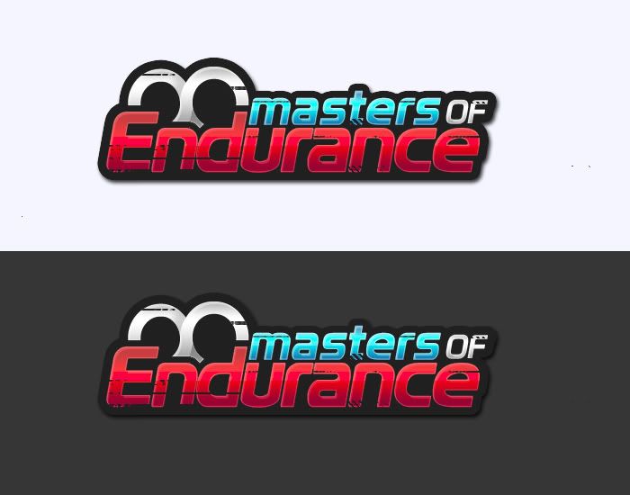
Yeah just thought id have a crack, normally do proffessional looking ones.. so.. umm, it probably doesnt suit the style..

and im a freelance graphic designer before u go off like before :P
Attached images
M0e.jpg
Quote from aoun :Also, research and meanings are important to certain designs (to the extent where a racing site needs to look like a racing site not a barbie doll site.), but i think that looks are very important. Design is all about looks, true or false? If it looks bad, then its bad, if it looks good, then its good.. right? If that made sense, as long as it looks good, thats it.. to a certain point.


I see no blue teeth....!


Here,
"The Bluetooth wireless specification got its name from Harald Blaatand (translates to "Bluetooth"), a 10th-century Danish king who used diplomacy to negotiate a truce between two feuding factions. In fact, the Bluetooth logo is an overlay of the Danish characters for the king's initials: H.B."

See what i mean? A well prepared logo should have a meaning or a story hidden in it. Othervise, it will be just an image which everyone will say something about it and decided just by looking at it's colours and font look good or not.

Of course it is just my opinion and sadly i know only very few people agree including some pro designers...
Quote from ZORER :Of course it is just my opinion and sadly i know only very few people agree including some pro designers...

I'm not disagreeing entirely with you, but where you say "must" I say "can".

What is important, in the Bluetooth logo, is not that there is a history behind the form, but that there is identity to it. You look at it and think.. "mmm... dongle...".
Quote from ZORER :...

Although I agree with you that a logo shouldn't just be a nice image, I believe that the inifinite sign isn't as far fetched or wrong as you make it seem.

You are right, the races aren't infinite, or never-ending, but they are very long. Compared to the 5-lap online pickup races on random servers they are seemingly endless anyway.

So question is, what is more important.. the fact that the races aren't endless (the in my opinion minor downside of using the sign in a logo for this series), or the fact that the infinite sign (again, in my opinion) displays nicely how much of an effort it takes to be successful in a league with long races.
Zorer, i agree with you alot more then you think i do. I personally think your correct, really. But i think whats more important is the look of the logo to give an identity. Look at the LFS logo.. What? a checkered flag? Abit poor but look at them three colours with speed under Live For. The aqua/silver/orange. The font. It has its own good look which gives it its identity. Nothing special, but such an awesome logo.

F1 logo? Whats so F1 about it? Nothing. But it looks sensational and has its OWN look, making the identity. My nephew (5years old) has no clue that there is a 1 between the F and the spikey thing, but as soon he sees the logo he says to me, "chris are you playing formula 1". Thats a logo .
Just a reminder, guys. The deadline is this Friday.
My shot at this. 2 are simple and modern, 2 are somewhat more advanced regarding the graphics.

1, http://i148.photobucket.com/al ... danev9/MOELogo1pdanev.jpg

Not much to say here, infinity logo is the focus, with some checkered graphics ontop of it to give it a more racing-ish look.

2, http://i148.photobucket.com/al ... danev9/MOELogo2pdanev.jpg

The two red squares resemble the infiinty sign.

3, http://i148.photobucket.com/al ... danev9/MOELogo3pdanev.jpg

The idea here is a bit more abstract. The two "arrows" represent that you race a lot "there and back", meaning a lot of laps / an endurance race.

4, http://i148.photobucket.com/al ... danev9/MOELogo4pdanev.jpg

Some checkered graphics as a background, MOE in a bit faded way, infinity sign. I'm not very happy with the colors here, something brighter would be more striking and eye catching, perhaps like on the 1st logo.
I'm no designer by any means but I love to play around with photoshop and pretend I'm some design whiz, but I know a few fundamental things that apply to how branding works and how logos and company names work.

I see a lot of you seem to think for a logo to become successful it needs to tell you exactly what it represents, which isn't true, but is more of an added bonus if somehow you strike it lucky to achieve and deliver what it is you're making this logo for. Take a few examples of the big brand names and logos around the world, only very few of these tell you instantly what it is this company does with the logo they use.

Just look at the big yellow M that McDonalds use, how does that tell you that they sell food? It doesn't but you associate the big M with food because they've been bombarding you with it for years in advertisement. So any logo anyone here produces is valid and is worthy to become the new MoE logo, it doesn't need to include the infinity loop or anything that really tries to suggest endurance, because ultimately its how the logo is used and seen that will add this association.

Loving some of the suggestions so far, I'd love to submit something but I is a newb and I'd feel embarrassed cause you'd all laugh
Here is my version!

Its a beta Version!!!
v. 0.3
Attached images
MOE.jpg
Something clock orientated
Attached images
moe_logo_clock_grey.png
moe_logo_clock_lfs.png
1 day to go!
IRC knows the winner already, and it's the only one that deserves winning anyway...
Quote from Gil07 :IRC knows the winner already, and it's the only one that deserves winning anyway...

Nakki 4evah
Spoilers


Attached images
moe_logo_inf.png
moe_logo_inf2.png
Heres my entry.
Attached images
MoE.png
I spend 2 hours on the M alone
Attached images
MoE_logo.gif
Its all over, this guy has won it. Teach me your skills r4ptor!!
Quote from aoun :
Can take off dirt if requested.

I personally like it. My mind interprets that more as wear than dirt, and that's very appropriate.

Edit: I should add that I also saw a pair of boobs initially, so take my opinion with a pinch of salt.
Quote from Albieg :I should add that I also saw a pair of boobs initially

Me too, but then I Alt-Tabbed to this. Nice work, aoun.
Only comment: perhaps do away with drop shadow so the stroke stands out better.

EDIT:
Should add that I also like Adam2k8's entry (kudos for the non-infinity theme that everyone else stuck to) and ATC QuickSilver's.

FGED GREDG RDFGDR GSFDG