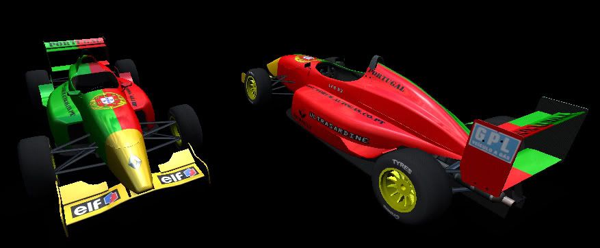
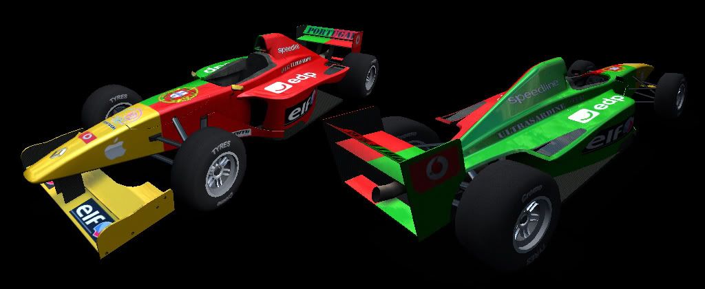
hi, my first ever FOX skin so go easy, but be honest. public of course if anyone thinks its good enough to use. any opinions/critisism welcome as always
I don't know, but I did one of the '99 Minardi. Unfortunately it ended up looking like I loaded a shotgun with weird little Italian companies and blasted it, but that's their fault, not mine.
A little experiment I've been trying using layered textures in PSP to create metallic "metal flake" paints. Some of my latest ones have come out better, but I still like these. The black one is cool- kinda has a '70's Lotus "John Player Special" feel. Once I get the layering formula down (no pun intended):rolleyes: I'll post the merged layer files in a jpg format
look pretty good I think you need to make the metal flakes smaller (or just use a higher resolution) and maybe add in a gradient overlay to get a more metallic look though.
The black looks ok, he red seems a bit flakey as said above.
Also on the rear wing is the momo supopsed to be upside down?
Nice skins though, i feel i shoulud try and figoure out how do make metallic looking skins.
or if you already have 3ds max you can download a scene from http://ds-autos.digiserv.net/scenes.php and cheat a little :P. Althrough they seem to be from patch q (old style steering wheel in the fox)
Getting the metallic flakes smaller was always my biggest problem- the textures in PSP only go so small, and I have to layer several of them at different angles to "randomize" them so there isn't a noticable pattern. I chose not to add a linear gradient because under dynamic lighting it might look a little strange.
Your tip worked really well, though- I didn't realize I could skin at higher res than 1024. Here's a FOX at 2048x2048
Glad I could help Here is a link to Master Skinnerz. Includes a great forum, LFS logos, and 2048 res skin kits. I'd suggest you sign up there and give the skin kits a try
Your right about the MOMO logo. I originally intended for it to be seen from behind the car, but now I realize that because of the wing angle, you can't see it from there. I just turned it around, and it looks much better.
Starting to feel it now. Some of the curves on the minardi paint scheme just don't lend themselves to the curves of the F08, but I think that's pretty close to the base paint scheme.
Let me know what you think. Should be done by tomorrow evening.