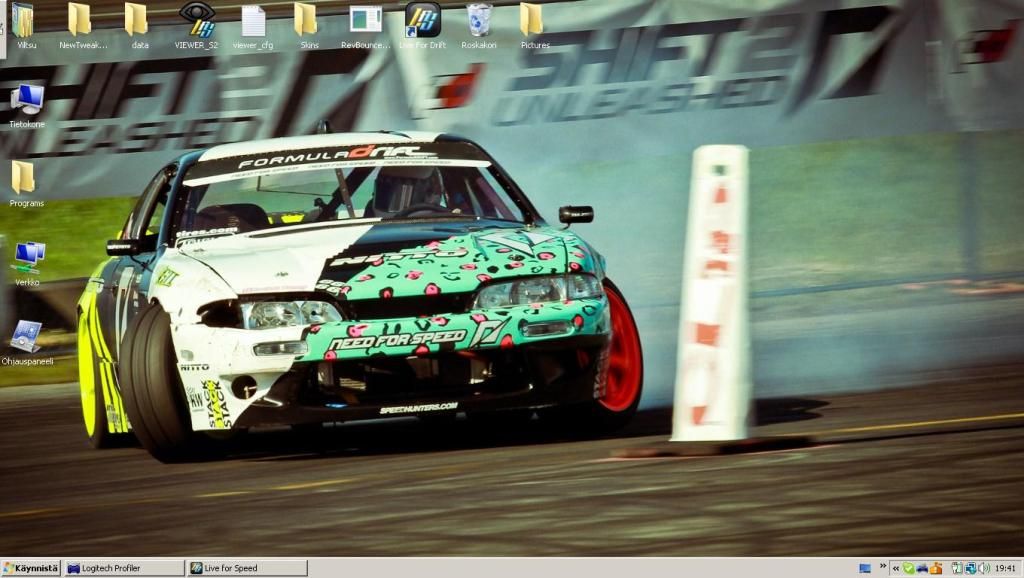
1,024px × 578px?
Resized from 1366x768 maybe and lost some pixels from top of the screen.


Pretty stock I guess. Nothing fabulous.
I don't like Monster and Ken Block at all, but this livery and shot is great.
Not mine, but great!
Sweet.
i'm seeing him tomorrow :3
Just built brand new PC.. with Win 7 64 ultimate.. Gonna install LFS and play for the first time in many years.. about 5 or so years?


Something new
Finished upgrading to windows 8; never going back to 7
Great to see someone that loves it as well insteas of "AMAGAWD METRO SUX".
I'm loving it so far, even love my lock screen, so simple.
edit: looks to be really useful on two screens btw, getting the best of both worlds eh?
I'm loving it so far, even love my lock screen, so simple.

edit: looks to be really useful on two screens btw, getting the best of both worlds eh?
Simple yet elegant; haters ALWAYS find something to hate on.................
about the multi mon.? HELLS yeah makes it even better
about the multi mon.? HELLS yeah makes it even better
I just couldn't help myself from hooking up an old screen and...
Installed Win 8 aswell (mainly because I got it for free) and while the kernel improvements are pretty nice, the default metro interface is just as shit as I expected for desktop computers.
Fixed that easily by killing all the default metro apps and started using Start8, so now it serves as a larger start menu without interrupting my workflow in desktop.
Fixed that easily by killing all the default metro apps and started using Start8, so now it serves as a larger start menu without interrupting my workflow in desktop.

Metro is great, I'm loving it, the problem for me is that they didn't adapt it to every single screen and application, making it weird when you switch from one to another all the time. Everytime I go from metro to the old one feels like travelling to the past in a time machine... Hopefully sooner or later, maybe with Win 9, we will only see the new style and we can finally say good by to the classic one, which is been with us for too long and was time to replace it.
Well done MS, now please finish the job...
Well done MS, now please finish the job...
Fun fact: most of Metro haters haven't even used it (for more than couple minutes).
I just think most people are apprehensive of change. Personally, I love the metro interface; makes me feel like it's the next step in human pc interaction, of course morons will debate this as well...........
So what advancements do you think metro has for a desktop user without a touch screen?
I'm genuinely curious.
I'm genuinely curious.
Finally found out how to organize it in a way I like
1st Default apps
2nd Metro apps that I downloaded
3rd My Computer and folders
4th Most used software

As I used to do since XP, the "all programs" window is organized by categories. Useless shorcuts are hidden, so all the apps are visible, no need to scroll to the right to see them all.

Old and kinda useless dekstop with same color as the Metro one and with no icons. In this way I don't feel the continuous desktop switching, feels the same just with no tiles. And because of the way I organized the rest, I don't need any icon in there.

1st Default apps
2nd Metro apps that I downloaded
3rd My Computer and folders
4th Most used software

As I used to do since XP, the "all programs" window is organized by categories. Useless shorcuts are hidden, so all the apps are visible, no need to scroll to the right to see them all.

Old and kinda useless dekstop with same color as the Metro one and with no icons. In this way I don't feel the continuous desktop switching, feels the same just with no tiles. And because of the way I organized the rest, I don't need any icon in there.

You ruined Windows 8 by putting Google on it.
Post your desktop!
(5025 posts, started )
FGED GREDG RDFGDR GSFDG

